All Nonfiction
- Bullying
- Books
- Academic
- Author Interviews
- Celebrity interviews
- College Articles
- College Essays
- Educator of the Year
- Heroes
- Interviews
- Memoir
- Personal Experience
- Sports
- Travel & Culture
All Opinions
- Bullying
- Current Events / Politics
- Discrimination
- Drugs / Alcohol / Smoking
- Entertainment / Celebrities
- Environment
- Love / Relationships
- Movies / Music / TV
- Pop Culture / Trends
- School / College
- Social Issues / Civics
- Spirituality / Religion
- Sports / Hobbies
All Hot Topics
- Bullying
- Community Service
- Environment
- Health
- Letters to the Editor
- Pride & Prejudice
- What Matters
- Back
Summer Guide
- Program Links
- Program Reviews
- Back
College Guide
- College Links
- College Reviews
- College Essays
- College Articles
- Back
The Process of Painting MAG
I've always felt like I straddled the fence that divides colors and words, hoping to somehow be the bridge. When I was in third grade I tried to explain to my mom that my teacher was a green teacher and my friend's teacher was a blue teacher. She didn't get it. She didn't understand that when I said green, I meant soft-spoken yet realistic, and when I said blue, I meant calm and nurturing. I just didn't know those words yet. All I knew was that I associated feelings and emotions with colors. Subconsciously I've always related life to the ROYGBIV spectrum. My math binders are repeatedly black. And my English binders are always pink. It wasn't until I visited France that my theory came full circle and manifested itself in the form of a water lily. Let me explain.
Tucked away in a corner of northern France, on the fertile banks of the Seine, lies the heart of Impressionism. Giverny, a quiet village with cobblestone streets and quaint cottages, is privy to a trickle of tourists, mostly older women, who make the pilgrimage to see arguably the worlds' most beautiful garden. Monet would likely be annoyed that his home and haven is constantly encroached upon by eager sixty-somethings toting digital cameras. Maybe he would rest a little easier knowing his home taught me something about life.
Before I divulge my water lily/life metaphor, let me state that I am not one who usually gets philosophical about art. When I went to the Metropolitan Museum, I didn't ponder how Van Gogh's sunflowers made me feel about the bursts of hope in mental illness; when I went to the Louvre I walked quickly by the Mona Lisa, unimpressed; and when I went to the Museum of Modern Art in New York, I scoffed at the apparent simplicity of certain “scribbled” pieces. I am far from an art enthusiast. However, I have always held a certain fondness for Impressionism, and as I biked the miles back to Vernon, home to Giverny's nearest train station, I realized why.
Impressionism is in fact realism. While Merriam-Webster makes the case that the blended colors of realist paintings, with their brush-strokes indecipherable, is the most veracious portrayal of actuality, I disagree. It is through the muddled messiness of Impressionism that something realistic is brought to fruition. Life is never clean and smooth.
Everything I have done in my life is akin to one paint stroke, completely independent from, yet entirely dependent on, the other dollops for meaning. My life in its entirety is the canvas. It started out blank but is currently in the process of becoming something beautiful. My first memory of joy is as a three-year-old running through a Pooh-bear lawn sprinkler with my dad. A thick yellow glob of paint and a sun-filled recollection. In and of itself it's a lovely color and an even lovelier memory, but when combined with every other shade of my life, it gains weight, purpose, and meaning. When I think of being three, I think of light yellows and pale blues, carefree days spent under a warm California sun.
When I think of being nine, I think of orange and uncertainty. What is orange really? It's not mean, passionate, and convicted enough to be red but not cheerful enough to be yellow. I was an orange nine-year-old, relocated to Little Rock, who quickly had to adapt to a Southern world of “yes ma'am” and “no ma'am,” grits, hogs, and “fixin' to.” I didn't like it.
When I think of the summer of 17, I think about the brightest of turquoises and the prettiest of lilacs, the best three months of my life. But every action and every moment in between fills those years with varying degrees of color. Dark gray for when I hung up the phone and cried big tears and my mom held me on our leather family room sofa – my first encounter with death. Coral for when my fifth-grade crush brought me a heart-shaped box of Reeses and asked to be my boyfriend on Valentine's Day. Purple for secret rendezvous and sneaking out of the house. Green – pragmatic and reliable – for hours spent studying. Brown – ugly, mean-spirited brown – for the first time I got made fun of for being Mormon. Red for love.
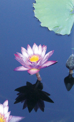
I think Monet understood this when he painted his water lilies. He knew there is necessity in the dark shades, for without them to throw the pastels into relief there would be no contrast and no beauty. Life is the same. Every stroke combines to create something magnificent, but it is up to us to create the masterpiece. I cannot say for certain what my canvas will turn out to be, I only know there is truth and fulfillment to be found in the process of painting.

Similar Articles
JOIN THE DISCUSSION
This article has 0 comments.
